14 Lift Widgets
In this chapter we’re going to discuss widgets in Lift. A widget is essentially a library of Scala and JavaScript code that together provide packaged XHTML fragments for display on the client browser. In other web frameworks (JSF, Struts, etc) these are sometimes called components. An example of a widget would be small library that automatically embeds a Calendar instance (section 14.1.2↓), or a helper library to sort HTML tables (section 14.1.1↓). Typically widgets embody dynamic behavior on the client side, which is what makes them so attractive; static client-side content is already dead simple to generate in Lift with snippets, so the extra sauce of JavaScript binding and Ajax callbacks really makes advanced functionality easy.
Lift’s widgets are intended to minimize effort on your part. Unlike some other frameworks where widgets/components require the use of specific traits or special XML binding, Lift (and Scala’s) inherent flexibility with XML, JavaScript abstraction, and snippet generators make using widgets as simple as dropping in a few lines of code to your existing snippets or views.
14.1 Current Lift Widgets
To start, we’ll cover the current set of widgets included in Lift at the time of writing this book. These widgets are contained in the lift-widgets module, which means you’ll need to add the dependency to your pom.xml if you want to use them (section A.5.1↓). While this list will likely grow over time, remember that widgets are based on the fundamentals of Scala’s XML functionality as well as Lift’s JavaScript support (chapter 10↑), so the same general rules apply to all of them. At the end of the chapter we’ll cover writing your own widgets (section 14.2↓).
14.1.1 TableSorter widget
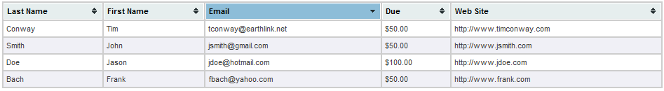
The TableSorter widget is based on the TableSorter jQuery plugin [H] [H] http://tablesorter.com/docs/. Basically, the TableSorter widget allows you to take an existing HTML table (THEAD and TBODY tags are required) and add sorting to columns in the table. By default, the widget handles sorting of numeric, currency, and other value types automatically. The full capabilities of the plugin are beyond the scope of the widget, however; if you need more features you’ll have to set up the JavaScript yourself instead of using the widget.
The first step in using the widget is to call the TableSorter.init function in your Boot class to make Lift aware of the resources used by this widget. Then, you need to set up a table in your page (either statically in the template or via a snippet):
TableSorter Template
<lift:surround with="default" at="content">
    <lift:TableSorterDemo/>
    <table id="table-id" class="tablesorter"> ... </table>
</lift:surround>
Note that you need to have an id attribute on the table and add the tablesorter class to the table element. Next you simply call the TableSorter widget from a snippet:
TableSorter Snippet
class TableSorterDemo {
def render(xhtml: NodeSeq): NodeSeq = TableSorter("table-id")
}
The argument to TableSorter is the HTML element id of the table you want sorted. The TableSorter code relies on head merge (section ↓) to put the appropriate JavaScript and jQuery functions into the returned page.
14.1.2 Calendar widgets
There are three calendar widgets corresponding to month, week and day views. These widgets display calendars with a similar look and feel to Microsoft Outlook or Google Calendar.They provide basic functionality for display, but you can easily customize CSS and JavaScript hooks for calendar items to fit your application requirements.

This widget allows you to create month view calendars in your web page, manage your calendar events etc. The first thing you need to do is call the CalendarMonthView.init function in your Boot class; this performs initialization by telling Lift’s ResourceServer about the paths to JavaScripts and stylesheets needed by this widget since these dependencies are embedded in the same jar file (we’ll cover this topic more in section 14.2↓).
The template for our widget example is relatively straightforward, as shown in listing 1↓. Basically, we provide a binding element where the calendar will be rendered.
In our snippet code, listing 1↓, we first perform some setup of the widget. The Calendar widget takes a java.util.Calendar instance telling it which month to display. Additionally, it takes a Seq[CalendarItem] of items to be displayed on the calendar. Finally, it takes three arguments containing optional JavaScript functions to be called when an item, day, or week is clicked, respectively. In our example we’re not showing any events or setting up any callbacks.
In addition, CalendarMonthView can also take a MonthViewMeta instance as the second argument so that you can control the first day of the week and the locale used for formatting dates and times. For instance, we could set the calendar to use Monday as the first day of the week:
"widget" -> CalendarMonthView(c,
              MonthViewMeta(Calendar.MONDAY, Locale.getDefault),
              Nil, Empty, Empty, Empty)
Of course, without anything to display or do this isn’t very useful, so let’s look at how you create CalendarItems.
Listing 1↓ shows how we can create a calendar item for a meeting on June 5th at 2:30 pm. We have to set up another Calendar instance to hold the time of the meeting, then we use the CalendarItem helper object to set up the actual item instance. The first parameter is the id of the div that will be created for the item. This can be used from other scripts if needed. The second argument is the time of the event. The third argument is the CalendarType of the event, in this case, a meeting. The optional method on CalendarItem allows you to set optional attributes essentially via a sequence of (CalendarItem) ⇒ CalendarItem functions. This technique is used since CalendarItems are immutable and modifying them returns new instances.
The widget renders not only the XHTML to display the calendar, but it generates the <script> and CSS tags using head merge to control display. One common customization of the widget would be to override the CSS used; to do this, provide your own style.css file under the WEB-INF/classes/calendars/monthview directory in your project. Because Lift uses the classpath to load resources, your style.css file will be “found” before the default one bundled in the lift-widgets jar file. You can use the default style.css as a starting point [I] [I] http://github.com/dpp/liftweb/tree/master/lift-widgets/src/main/resources/toserve/calendars/monthview/style.css.
The final thing we’d like to cover for the Month view is the JavaScript callbacks. These callbacks are constructed using the AnonFunc JavaScript artifact, which essentially constructs an anonymous function on the client side. Listing 1↓ shows an example of using the callbacks to redirect to an event view page for the given event when the item is clicked. In this example we assume that the id of each calendar item is its unique id in the ORM (section 8.1.4↑) and that we have a rewrite rule set up to handle item viewing (section 3.7↑).
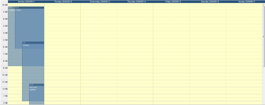
The CalendarWeekView widget provides a weekly view of the calendar. The same general principles apply as for month view. Again, you need to initialize the CalendarWeekView by calling the CalendarWeekView.init function in your Boot class.
Listing 2↓ shows a snippet returning a week view. As you can see, we still use a Calendar instance to set the time, and we also provide a WeekViewMeta in this example to set the first day of the week and the locale. The list argument is a Seq[CalendarItem], constructed exactly the same as for a month view. Finally, we provide a JavaScript item callback. Note that there aren’t day or week callbacks available.
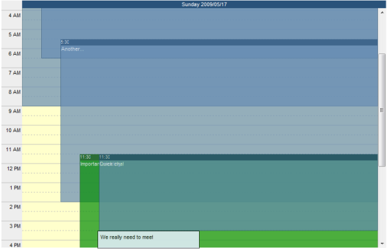
The CalendarDayView widget renders a calendar for a single day. The usage is essentially the same as for the month and week views, as shown in listing 3↓:
The parameters are essentially the same, except that the Calendar object represents the day that we want to render and we pass a DayViewMeta containing just the Locale for internationalization purposes. Again, only an item click callback is available.
14.1.3 RSS Feed widget
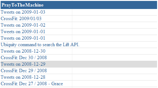
The RSS feed widget, like its name implies, simply renders RSS feeds. This widget does not need initialization in Boot since it has no dependencies on JavaScript, CSS, etc. In your snippet you simply use the RSSFeed helper object with the RSS feed URL:
RSSFeed example
class RSSFeedDemo {
  def render(xhtml: NodeSeq): NodeSeq = {
    RSSFeed("http://www.praytothemachine.com/evil/index.php/feed/")
  }
}
Although the RSSFeed widget doesn’t provide its own CSS, the generated elements do have CSS classes attached to them that you can provide styling for:
rsswidget This class is attached to the outer div that contains all of the feed elements
rsswidgettitle This class is attached to the <li> that holds the title of the feed
rsswidgetitem This class is attached to each <li> element that holds an RSS item
14.1.4 Gravatar widget
Gravatars are globally recognized avatars [J] [J] http://gravatar.com. You can add your picture at the Gravatar website and associate it with one or more email addresses. Sites that interact with Gravatar can fetch your picture and display it, which is what the Gravatar widget does. Listing 14.1.4↓ shows an example snippet that will render the Gravatar for the currentUser into a <div>, if available. The default size of the Gravatar is 42x42 pixels, but you can override this with additional parameters on the Gravatar.apply method. Additionally, you can filter the Gravatar based on its rating (the default rating is “G” only).
14.1.5 TreeView widget
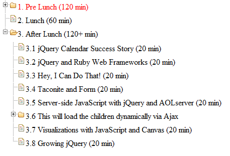
The TreeView widget transforms an unordered list (<ul>) into a tree-like structure using the TreeView JQuery plugin [K] [K] http://docs.jquery.com/Plugins/Treeview. Each nested unordered list gets decorated with a +/- sign that allows you to collapse or expand the entire sublist, as shown in figure 14.6↓.
To use this widget you first need to initialize the widget by calling the TreeView.init function in your Boot class. For basic usage, your snippet looks like listing 14.1.5↓. The first argument is the id of the unordered list that you want transformed into a tree. The second argument is a JSON object that is used to configure the tree view. In our example, we’re setting the treeview to animate opening and closing of nodes with a 90 millisecond delay; for more options see the treeview jQuery documentation page.
In addition to transforming static lists into trees, the TreeView widget also supports asynchronous loading of trees and nodes via Ajax calls. In order to do this, you still need to provide an empty <ul> element with an id attribute; this is essentially modified in place as portions of the tree are loaded. Next, you provide two functions that are used to retrieve the Tree data:
- A function () ⇒ List[Tree] to load the initial view of the tree. This is what will be displayed to the client when the page loads, so if you want some nodes to be available without having to make an Ajax call this is where you define it.We will explain the Tree class in a moment.
- A function (String) ⇒ List[Tree] to load the children of a given node (the String argument is the node’s id)
The Tree class defines each node in the tree and contains several values that define the appearance and behavior of the node:
text The text to be displayed in the list item.
id The optional HTML id of the element
classes An optional string defining CSS classes to be assigned to the element
expanded A boolean controlling whether the element will be expanded initially (only valid if the haschildren is true or if the children list is populated)
hasChildren If this is set to true but the children value is Nil, then the TreeView widget will dynamically load the children of this node as described in item #2 above
children A List[Tree] defining the children of this element. Setting this value will prevent Ajax from being used to retrieve the list of children from the server on expansion
The Tree companion object has a number of overloaded apply methods that make it easy to set one or more of these values without having to set all of them.
To provide a concrete example, listing 14.1.5↓ shows implementations of the loadTree and loadNode functions corresponding to the two Ajax functions used to dynamically construct the tree.
In this example the initial view will show three nodes; the third node (“Dynamic node”) will fetch its children via an Ajax call when expanded. The loadNode method will then handle this call by adding two static leaf nodes to the tree.
14.1.6 Sparklines widget
The Sparklines widget is based on Will Larson’s excellent Sparklines JavaScript library [L] [L] http://www.willarson.com/code/sparklines/sparklines.html. Sparklines are essentially small, high resolution charts embedded in text that provide a wealth of information in a compact representation [M] [M] The term “Sparkline” was introduced by Edward Tufte in his book Beautiful Evidence. Dr. Tufte’s work is a must read for anyone who si working with visualizing large volumes of data..
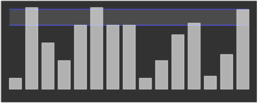
As with our other widgets, you need to initialize the widget in your Boot class by calling Sparklines.init. Listing 14.1.6↓ shows a simple snippet utilizing the widget to produce the graph shown in figure 14.7↑. In your template you need to provide a canvas element with an id attribute that will be used by the widget for its content. In our example we provide a JsArray (an abstracted JavaScript array) with our data, as well as a JSON object containing options for the chart [N] [N] More options can be found on Will Larson’s Sparklines web page. We’ve set our options to draw percentage lines for the bar chart as well as filling in the area between the percentage lines. Finally, we call the Sparklines.onLoad method to generate the chart drawing code (the chart will be drawn when the page is loaded). The Sparklines library currently handles bar and line charts, which are chosen via the SparklineStyle enumeration.
class SparklinesDemo {
  def render(html: NodeSeq): NodeSeq = {
    val data = JsArray(100,500,300,200,400,500,400,400,
                       100,200, 345, 412, 111, 234, 490);
    val opts = JsObj(("percentage_lines" -> JsArray(0.5, 0.75)),
                     ("fill_between_percentage_lines" -> true),
                     ("extend_markings" -> false));
    Sparklines.onLoad("bar", SparklineStyle.BAR, data, opts);
  }
}
14.2 How to build a widget
As we explained in the introduction, there is no magic formula when building a widget since Lift and Scala provide so much base functionality without having to resort to restrictions like traits or static XML binding. However, there are a few items to note if you want to design your own widgets
Generally it’s useful to make your widget a self-contained JAR file to simplify dependency management and deployment. Including things like style sheets and javascript libraries in your package is quite straightforward if you’re using Maven, but the question then becomes how do you access these resources from a Lift application. Fortunately, Lift provides some very simple mechanisms for using class loaders to retrieve resources. The basic functionality is handled through the ResourceServer object [O] [O] net.liftweb.http.ResourceServer, which we cover in detail in section 9.8↑. This object controls resource loading, and in particular handles where resources can be loaded from. Listing 14.2↓ shows an example init method (similar to those that we’ve previously used for the existing widgets) that tells the ResourceServer that it can load resources from the path “/classpath/mywidget”. You would locate these resources under the mywidget package in your widget project.
Once you’ve set up the appropriate permissions, your widget can generate links or scripts that load from within the classpath, as shown in listing 14.2↓. In this example we’ve defined a simple (and slightly ridiculous) widget that renders a given URL into an IFrame element.
Note the path that we used uses the LiftRules.resourceServerPath variable. It’s preferable to use this mechanism instead of hardcoding “/classpath” to allow for end-user flexibility. We also use head merge to make sure the proper stylesheet is loaded for the page.
As you can see, defining your own widget is not much different than writing a snippet. The major difference is in making resources accessible while bundling and making sure that you avoid hardcoding properties that are configurable by the end-users of your widget.
(C) 2012 Lift 2.0 EditionWritten by Derek Chen-Becker, Marius Danciu and Tyler Weir